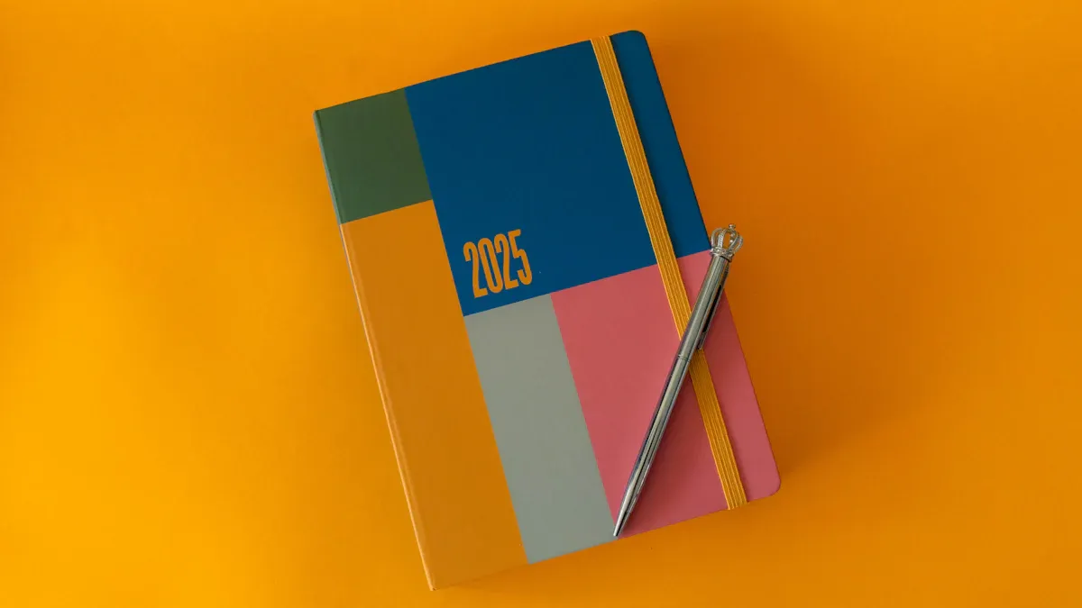
Top 10 Color Trends Designers Are Loving in 2025
Why Color Trends Matter in Design
Boosting Brand Relevance and Appeal
Have you ever noticed how certain brands feel instantly recognizable? That’s the power of color trends. Colors evoke emotions and communicate messages faster than words. For instance, 85% of people say color is the main reason they purchase a product. It’s not just about looking good—it’s about creating a connection. Strategic color choices can highlight your brand’s personality and values, making it easier for customers to relate to you.
Think about this: visitors notice a website’s visual appearance first. Colors guide their behavior, encouraging them to take specific actions, like clicking a button or exploring further. Consistency in your brand’s color palette builds trust and reinforces recognition. By staying updated with trending color palettes for 2025, you can keep your brand fresh and relevant in a competitive market.
Inspiring Creativity and Innovation
Color trends don’t just influence consumers—they spark design inspiration for creators like you. Designers in industries like fashion, marketing, and interior design use colors to set the tone for their work. For example, in fashion, seasonal colors define collections and trends. In interior design, muted greens or warm neutrals can create calming atmospheres that influence mood and interaction.
Innovation thrives when you experiment with colors. Whether you’re designing for a sustainable future or exploring tech-driven concepts, the right palette can transform your ideas into something extraordinary.
Meeting Consumer Expectations and Preferences
Consumers expect brands to stay ahead of the curve. Did you know 62%-90% of first impressions are based on color alone? By aligning your designs with current color trends, you meet these expectations head-on. People gravitate toward designs that feel modern and relevant. When you incorporate trending colors, you’re not just following a fad—you’re showing your audience that you understand their tastes and preferences.
Top 10 Color Trends for 2025
Deep Reds and Burgundies
Deep reds and burgundies are making a bold statement in 2025. These colors exude confidence, passion, and sophistication, making them perfect for both fashion and interior design. Whether it’s a burgundy accent wall or a deep red evening gown, these shades create a sense of drama and elegance. Designers love how these hues can evoke warmth while still feeling luxurious.
You can use deep reds to add a pop of color to neutral spaces or to create a striking monochromatic look. Pairing burgundy with gold or brass accents can elevate the richness of the design, giving it a timeless appeal.
Dark Blues and Navies
Dark blues and navies are the ultimate classics that never go out of style. In 2025, these shades are being reimagined with a modern twist. They’re versatile, calming, and perfect for creating a sense of depth in any design. From navy blue suits to moody blue interiors, these colors are everywhere.
You might notice how dark blues pair beautifully with trending colors like muted greens or warm neutrals. This combination creates a balanced and serene aesthetic that feels both contemporary and grounded.
Rich Browns and Caramels
Rich browns and caramels are having a moment, and it’s easy to see why. These earthy tones bring warmth and a sense of grounding to any design. They’re perfect for creating cozy, inviting spaces or adding a touch of vintage charm to your wardrobe.
Consumers are gravitating toward timeless colors like antiquarian browns, which evoke a sense of personalization and nurturing. The shift toward these warmer hues reflects a desire for comfort and serenity in living spaces.
Plum and Dark Purples
Plum and dark purples are the epitome of luxury and creativity. These shades are bold yet sophisticated, making them ideal for statement pieces in fashion or focal points in interior design. A plum-colored sofa or a dark purple dress can instantly elevate the mood of a space or outfit.
These colors also pair well with metallics like silver or gold, adding a touch of glamour. If you’re looking to make a bold impression, plum and dark purples are the way to go.
Muted Greens and Olives
Muted greens and olives are dominating the 2025 color trend landscape, thanks to their connection to sustainability and eco-consciousness. These shades are calming and reflect a growing societal preference for authenticity and natural aesthetics.
Incorporating muted greens into your designs can create a serene and grounded atmosphere. Whether it’s an olive-green kitchen backsplash or a muted green blazer, these colors bring a sense of balance and harmony.
Soft Pinks and Mauves
Soft pinks and mauves are subtle yet impactful. These shades are perfect for adding a touch of femininity and elegance to your designs. In fact, there’s been a 4% increase in interest in mauve since 2022, showing how these colors continue to gain popularity.
You can use soft pinks and mauves in everything from branding to home decor. They pair beautifully with warm neutrals, creating a soft and inviting palette that feels fresh and modern.
Warm Neutrals and Beiges
Warm neutrals and beiges are the unsung heroes of the 2025 color trend. These shades are versatile, calming, and perfect for creating cozy spaces. According to the 2025 Interior Design and Color Trends Report, 49% of respondents favor these colors, making them a top choice for designers.
Honeyed neutrals like wheatfield beige are especially popular for their ability to evoke warmth and comfort. Whether you’re designing a bedroom or a living room, warm neutrals can create an inviting and lively atmosphere.
Bold Jewel Tones
Bold jewel tones like emerald green, sapphire blue, and ruby red are making waves in 2025. These colors are vibrant, luxurious, and perfect for making a statement. Jewel tones work well in both fashion and interior design, adding a touch of opulence to any project.
You can pair jewel tones with muted or neutral shades to create a balanced look. For example, an emerald green sofa against a beige wall can make a room feel both bold and sophisticated.
Dark Wood Tones
Dark wood tones are a nod to nature and craftsmanship. These shades bring a sense of richness and depth to designs, making them a favorite for furniture and flooring. They’re perfect for creating a warm and inviting atmosphere in any space.
Dark wood tones pair beautifully with muted greens, warm neutrals, and even bold jewel tones. This versatility makes them a staple in the 2025 color trend palette.
Black and Brown Combinations
Black and brown combinations are redefining modern design. This pairing, once considered unconventional, is now seen as chic and sophisticated. The contrast between the two colors creates a striking yet harmonious look that works well in both fashion and interiors.
You can use black and brown together to create a moody, elegant aesthetic. For example, a black leather sofa with brown wooden accents can make a living room feel both modern and timeless.
How to Incorporate 2025's Trending Colors into Your Designs
Fashion Applications
Incorporating trending colors into your wardrobe or fashion designs can elevate your style game. Colors like black, blue, and white are dominating the fashion scene in 2025. These shades not only exude a modern and minimalist vibe but also resonate with younger generations. Why? They’re everywhere in pop culture, from social media to blockbuster movies.
You can use these colors to create versatile outfits that reflect personal expression. A black leather jacket paired with a crisp white shirt and navy jeans screams effortless chic. Or, try adding bold jewel tones like emerald green or ruby red for statement pieces that turn heads. These colors also work beautifully in accessories, such as handbags or shoes, to add a pop of personality to any look.
Tip: Experiment with layering muted greens or soft pinks into your wardrobe for a fresh, eco-conscious twist.
Branding Updates
Updating your brand with trending colors can work wonders for its appeal. Take Burberry, for example. By maintaining its iconic elements while refreshing its color palette, the brand reclaimed its luxury status. Similarly, Comfort Union saw an 80% increase in conversions after refining its messaging and incorporating warm, inviting hues.
When choosing colors for your brand, think about the emotions you want to evoke. Jewel tones like sapphire blue can convey luxury, while muted greens signal sustainability. A well-thought-out palette can make your brand more relatable and memorable.
Print and Digital Media Usage
Trending colors play a crucial role in print and digital designs. Studies show that consumers make product decisions based on color in under 90 seconds. That’s how powerful your palette can be. Using bold jewel tones or muted greens in your designs can help your product stand out from competitors.
In digital media, colors influence moods and feelings. A calming navy blue background on a website can encourage users to stay longer, while a vibrant ruby red call-to-action button can drive clicks. For print materials, warm neutrals paired with soft pinks create a modern yet approachable look.
Pro Tip: Test different color combinations to see which ones resonate most with your audience. Small tweaks can lead to big results.
Recommended Color Pairings and Palettes for 2025
Balanced and Usable Assortments
Creating balanced color palettes is key to visually engaging designs. You want your layouts to feel harmonious, not overwhelming. Balance comes from the thoughtful placement of objects, textures, and colors. For example, pairing smooth textures with rough ones adds depth, while empty spaces create breathing room.
When you use trending colors thoughtfully, they can elevate your designs. For instance, triadic color palettes—three evenly spaced colors on the color wheel—create vibrant and balanced visuals. Tetradic combinations, which use two complementary pairs, offer richness and variety. These approaches ensure your designs feel cohesive and usable.
Neutral Hues with Delightful Accents
Neutral hues are timeless, but adding delightful accents can make them pop. Imagine a warm beige living room with emerald green throw pillows or a muted olive blazer paired with a ruby red scarf. These accents bring life to neutral spaces without overpowering them.
Surveys show that parents prefer neutral color palettes for children’s products, but they also appreciate playful accents. This insight highlights how neutrals paired with trending colors can appeal to a wide audience. Square palettes—four evenly spaced colors—are perfect for achieving this balance. They provide stability while allowing room for creativity.
If you’re designing a brand or interior space, try pairing soft pinks or mauves with warm neutrals. These combinations feel fresh and modern, making them ideal for 2025.
Moody and Deep Color Combinations
Moody and deep color palettes are perfect for creating bold, stylish designs. Dark colors like navy blue, plum, and burgundy evoke sophistication and intimacy. According to a Behr survey, 65% of Americans believe dark colors make a room feel bold, while 56% associate them with a stylish appearance.
These palettes work wonders in large spaces, making them feel cozier and more inviting. Pairing dark tones with muted greens or jewel tones creates a dramatic yet balanced look. For example, a plum accent wall with emerald green furniture can transform a room into a luxurious retreat.
If you’re working on branding, moody palettes can convey elegance and depth. They’re perfect for industries like fashion, tech, or luxury goods. Use trending colors strategically to make your designs stand out.
Design Styles That Align with 2025's Color Trends
Modern Minimalism Aesthetics
Minimalism isn’t just about simplicity anymore. Bold minimalism is taking center stage, blending clean visuals with striking elements for designs that grab attention. You’ll notice how vibrant color palettes, like jewel tones or muted greens, fit perfectly into this trend. These colors add depth without overwhelming the clarity that minimalism emphasizes.
Bold minimalism merges simplicity with impactful visuals.
It strips away unnecessary elements, focusing on efficient communication.
This style adapts seamlessly across mediums, from websites to branding.
If you’re looking for a way to make your designs stand out, try pairing muted greens with warm neutrals or jewel tones. These combinations create a modern yet approachable aesthetic.
Retro-Inspired Designs
Retro designs are making a comeback, and it’s easy to see why. Nostalgic colors like mustard yellow and burnt orange evoke timeless charm. Fashion brands are reintroducing hues from the 1960s, 1970s, and 1980s, giving them a fresh twist.
Retro colors appeal across industries, from marketing to interior design.
They bring a sense of familiarity while staying relevant to modern tastes.
These shades pair beautifully with dark wood tones or plum accents for a vintage-meets-modern vibe.
Want to channel retro energy? Try incorporating these colors into your branding or home decor for a playful yet sophisticated look.
Modern Luxury Themes
Luxury design thrives on strategic color usage. A cohesive palette, like jewel tones paired with muted greens, can elevate your brand’s positioning. Successful brands blend authenticity with premium aesthetics, creating designs that feel both natural and exclusive.
Consistent color usage builds strong recognition.
Jewel tones convey opulence, while warm neutrals add balance.
A well-curated palette enhances your brand’s story.
If you’re designing for luxury, focus on creating harmony between bold and subtle hues. This approach ensures your work feels polished and aspirational.
Sustainable and Eco-Friendly Styles
Eco-conscious design is more than a trend—it’s a movement. Muted greens and olives dominate this space, reflecting nature and sustainability. These colors create calming environments and resonate with consumers seeking authenticity.
Pair muted greens with dark wood tones or warm neutrals to highlight eco-friendly values. Whether it’s a sustainable fashion line or a green-inspired interior, these palettes connect with audiences who care about the planet.
Bohemian Chic Vibes
Bohemian designs embrace creativity and individuality. Soft pinks, mauves, and warm neutrals are perfect for crafting cozy, eclectic spaces. These colors bring warmth and personality, making them ideal for layering textures and patterns.
You can mix jewel tones with muted greens for a boho look that feels fresh and modern. Add artisanal elements like woven fabrics or handcrafted decor to complete the vibe.
Futuristic and Tech-Driven Concepts
Futuristic designs thrive on bold contrasts and sleek aesthetics. Dark blues, black, and jewel tones dominate this style, creating visuals that feel cutting-edge. These colors work well in tech branding, digital interfaces, and modern architecture.
Want to create a tech-forward design? Pair navy blue with black accents for a sleek, high-tech feel. Add pops of emerald green or ruby red for a dynamic edge.
Art Deco Revival Inspirations
Art Deco is back, and it’s more glamorous than ever. Milan’s design scene highlights this revival, blending vintage elegance with contemporary flair. Plum, burgundy, and gold accents align perfectly with this style, creating luxurious yet approachable designs.
"Art Deco is a pastiche of different styles united by a desire to be modern," says Dr. Anna Ruth Gatlin, assistant professor of interior design at Auburn University. This optimism resonates with today’s color trends, making Art Deco a timeless choice.
If you’re inspired by this revival, experiment with metallics and bold jewel tones. These elements add sophistication and charm to any project.