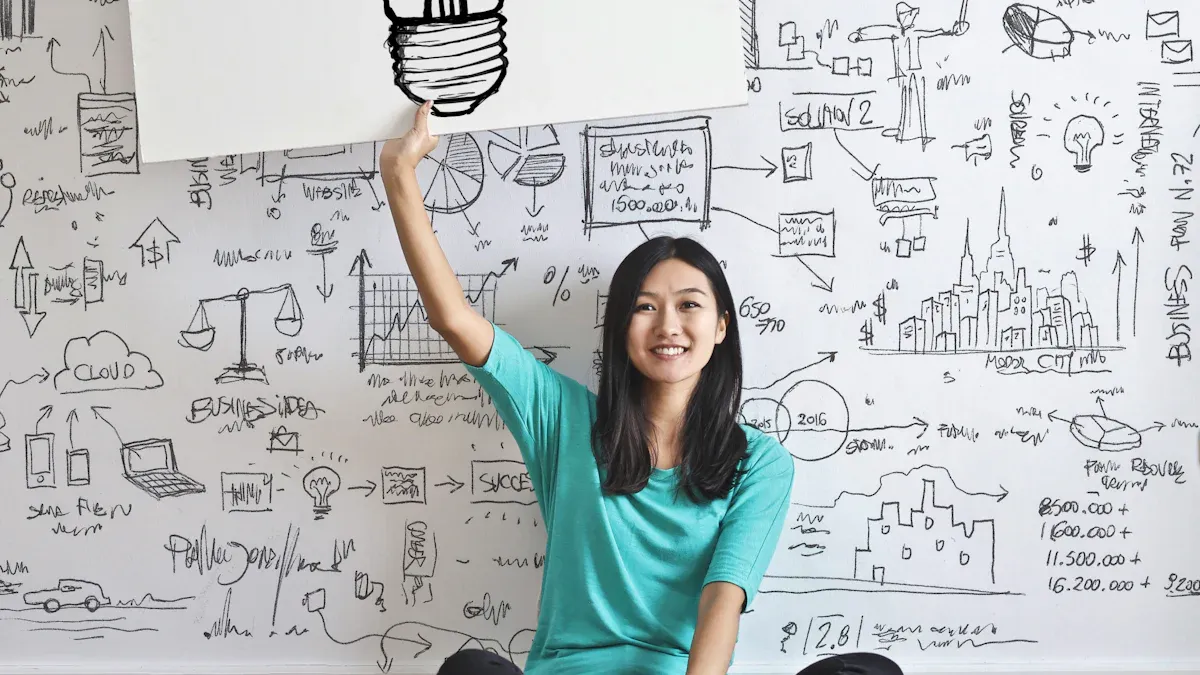
Mastering Design Principles for Effective Visual Communication
Design Principles are the key to good visual storytelling. They help you create designs that grab attention and function effectively. For example, research shows people finish tasks 35% faster and make 50% fewer mistakes with clear instructions. Utilizing these Design Principles can make designs easier to use and understand. Additionally, companies that focus on user-friendly designs often earn $100 for every $1 spent. Tools like print-on-demand services allow you to turn ideas into great products, spreading your work further.
The Importance of Design Principles
Why Design Principles Are Essential
Design principles are the foundation of great visuals. They help you create designs that look good and work well. By using these basic rules, your designs can share ideas clearly and connect with people. For example, putting similar items close together or using size to show importance helps people understand better. These methods make designs easier to use and more memorable.
Adding stories with pictures or videos makes designs even stronger. Studies say using visuals can save businesses money and time. TechSmith found companies save $1,200 per worker each year by using visuals. This shows how smart design choices can bring real benefits.
How They Improve Effective Visual Communication
Good visual communication needs to be clear, neat, and interesting. Design principles like contrast and size order help achieve this. Contrast makes important parts stand out and grab attention. Size order shows what to look at first, making it easier to follow.
Keeping designs simple and focused makes them better. Research says clean designs look more professional and are easier to remember. For example, using colors that match well makes designs more attractive and simple to understand. This is very helpful for websites and digital designs where people lose focus quickly.
By learning these principles, you can make designs that people remember. Whether it’s a website, poster, or product label, these tips make your work useful and fun to see.
Key Principles of Design Explained
Balance
Balance is a key idea in design. It makes designs look stable and nice. When parts are spread out evenly, the design feels calm and not messy. You can balance by thinking about size, color, and where things go. For example, a big, bold shape on one side can match smaller shapes on the other side.
There are two kinds of balance: symmetrical and asymmetrical. Symmetrical balance means both sides look the same, like a mirror. It gives a neat and formal look. Asymmetrical balance uses different parts but still feels even by using contrast and size.
Study | Findings |
|---|---|
Locher et al (1996) | Balance helps people judge beauty in designs. |
Nodine et al (1993) | Experts see balance as key to good design. |
McManus et al (1985) | People notice balance quickly in artwork. |
These studies show balance makes designs look better. Learning balance helps you make designs that look professional and complete.
Contrast
Contrast is a strong design tool. It makes important parts stand out. By changing color, size, shape, or texture, you can grab attention. For example, dark letters on a light background are easy to read.
Contrast also helps people use designs better. It makes text and pictures easier to see. Research says contrast makes layouts look nicer and helps people find things faster.
Design Principle | Impact on Visual Communication |
|---|---|
Contrast | Makes designs clear and easy to use. |
When using contrast, think about color matching. Colors like blue and orange pop out, while blue and green feel softer. Trying out contrast can make your designs both useful and fun to look at.
Hierarchy
Hierarchy means showing what is most important first. It helps people know where to look first. Using size, color, and placement can guide the viewer’s eyes. For example, a big title at the top grabs attention before smaller text below.
Good navigation needs clear hierarchy. Easy-to-see menus and links help users.
Studies show people look at pages in patterns, like the F-pattern. They check the top and left first, then move down. Placing key items in these spots makes designs easier to use and understand.
Hierarchy is very important in branding and design. It helps share a clear message and builds brand identity. Whether it’s a website, poster, or label, good hierarchy makes your design work well.
Repetition
Repetition is a key design rule that makes ideas stronger. Using the same colors, fonts, or shapes creates unity. This helps people recognize your brand and feel connected to it. For example, showing the same logo everywhere makes your brand easy to remember.
Repetition also improves how users experience your design. When designs repeat, people know what to expect. This reduces confusion and makes things easier to use. For instance, buttons that look the same on a website help users find clickable spots fast.
Studies show repetition helps people remember brands:
Study | Findings |
|---|---|
Janiszewski & Meyvis (2001) | Repetition makes brands easier to recognize. |
Janiszewski, Noel, & Sawyer (2003) | Repeating ads helps people remember brands better. |
Additionally:
Repetition builds trust in your brand.
It makes customers more likely to buy from you.
It shows your company is strong and reliable.
Using repetition wisely makes designs look good and stick in people’s minds.
Proportion
Proportion means the size of design parts compared to each other. It makes designs look balanced and neat. Good proportion helps designs feel organized and easy to look at. For example, big headlines with smaller text guide the viewer’s eyes naturally.
Proportion also helps arrange information clearly. Grouping related items and sizing them well makes content easier to understand. For instance, large pictures can highlight key points, while small text adds details.
In branding, proportion makes layouts look professional and polished. Whether it’s a website, poster, or label, proportion helps all parts work together smoothly.
Movement
Movement in design shows where the viewer should look next. It creates flow and keeps people interested. Lines, shapes, or patterns can guide attention to important areas. For example, curved lines lead the eye to a focus point, while diagonal lines add excitement.
Movement also makes designs easier to use. Guiding attention well helps users find information quickly and interact better.
Research shows movement matters in design:
Finding | Description |
|---|---|
Meaning's Role | Meaning helps guide attention more than image details. |
Variance in Attention | Meaning explains attention shifts better than image salience. |
Unique Variance | Meaning still guides attention when image salience is controlled. |
Additionally:
More research is needed on what guides attention in designs.
Some features, like number of items, may depend on visual traits.
Adding movement makes designs fun to look at and easy to use.
Rhythm
Rhythm in design makes things feel smooth and connected. It arranges visual parts in a way that feels natural. Repeating shapes, colors, or patterns helps guide the viewer’s eyes. This keeps people focused and interested in your design.
Rhythm links different parts of a design together. It creates harmony by repeating and spacing elements. For example, switching between bold and light text makes reading easier. Using grids can organize items neatly, making designs simple to use.
Rhythm isn’t just repeating things; it’s about changing them too. Adjusting size or spacing adds feelings and keeps designs exciting. This variety makes designs fun and stops them from being boring.
Designs with rhythm look professional and easy to follow. They improve user experience by making navigation simple and enjoyable. When designs flow well, people stay interested and understand the message better.
To use rhythm, keep things consistent. Repeat lines, shapes, or colors to make patterns. Then, add changes to make designs lively and guide attention. For example, evenly spaced images can lead to a bigger, standout image. This keeps designs attractive and directs viewers through the content.
Rhythm is great for improving how people use designs. It organizes different parts into fun sequences, making designs easier to follow and remember. Whether it’s a website, poster, or label, rhythm helps leave a strong impression.
Practical Tips for Applying Design Principles
Achieving Balance Through Visual Weight
Balance makes designs feel steady and calm. You can do this by spreading visual weight evenly. Visual weight means how much attention something gets based on size, color, or placement. For example, a big, bold headline on one side can match smaller, lighter text on the other.
Visual weight connects different parts, making designs look neat.
People like balanced visuals because they feel stable and natural.
Balanced layouts guide the viewer’s eyes smoothly across the design.
Try using symmetrical or asymmetrical layouts to create balance. Symmetry looks formal and tidy, while asymmetry feels lively and creative. Both styles use visual weight to stay balanced.
Using Contrast and Hierarchy to Guide Attention
Contrast and hierarchy help focus attention on key parts. Contrast shows differences, like light text on a dark background or bold shapes next to soft ones. This makes important areas stand out and easier to see.
Hierarchy arranges items by importance. Bigger or brighter parts catch the eye first, followed by smaller ones. For example, a bold title at the top grabs attention before the smaller text below.
Fonts matter in hierarchy. Picking clear fonts and sizes helps people read easily.
To use these ideas:
Add real content early to test contrast and hierarchy.
Arrange items so they’re easy to scan quickly.
Check designs with users to see if they guide attention well.
Incorporating Rhythm and Movement for Engagement
Rhythm and movement make designs fun and keep people interested. Rhythm repeats patterns, like switching colors or spacing shapes evenly. This makes designs feel connected and simple to follow.
Movement shows where to look next. Lines, curves, or diagonal shapes guide the viewer’s eyes to important spots. For example, a curved line could lead to a button you want people to click.
Studies show people naturally respond to rhythm. Babies move to music, showing rhythm’s universal appeal. Designers can use rhythm to create feelings, like excitement or calmness. For example, a heartbeat rhythm might connect with expectant moms emotionally.
To make designs engaging:
Repeat patterns to build rhythm.
Add changes to keep designs exciting.
Use movement to guide attention and create flow.
Organizing Information with Proportion and Proximity
Proportion and proximity help organize information in designs. Proportion means making parts the right size compared to others. This creates balance and makes designs look neat. Proximity means putting related items close together. This helps people understand how things are connected. When used together, these ideas make designs clearer and easier to use.
Grouping items properly helps people find things faster. For example, in online shopping, placing product details near pictures helps users. Proximity keeps related things together, reducing mess and improving the layout’s look. Grouping similar items also makes busy pages simpler to follow, helping users navigate easily.
Proportion grabs attention by using size. Bigger items catch the eye first, while smaller ones add details. For instance, a large title with smaller text shows what’s most important. This size balance helps viewers focus on key points. Keeping sizes proportional makes layouts look tidy and professional.
To use these ideas, start by checking your content. Group similar items and size them based on importance. Add space between unrelated parts to keep the design clean. When you balance proportion and proximity, your designs will look better and share ideas more clearly.
Reinforcing Brand Identity with Repetition
Repetition makes your brand easy to recognize. Using the same colors, fonts, and patterns often helps people remember your brand. This consistency makes your designs stand out.
Consistency builds trust. For example, using the same logo and colors on your website, social media, and packaging creates a unified look. This shows customers they’re dealing with the same brand everywhere. Repetition also makes designs easier to use. When buttons or layouts look the same, users know what to expect.
Repetition doesn’t mean copying everything exactly. It’s about repeating key elements to connect your designs. For example, you might use the same background pattern or font style for titles. These small details strengthen your brand without being too much.
To use repetition well, pick the main parts of your brand. Use these elements in all your designs. Whether it’s a special color or a unique font, repetition helps your brand stay memorable and recognizable.
Turning Digital Designs into Real Products
Advantages of Print-on-Demand Services
Print-on-demand services help turn digital designs into real items. They offer many benefits that make them great for designers and small businesses:
Start with little money since no bulk buying is needed.
Products are made only when ordered, lowering financial risks.
Many product options let you be creative and try new ideas.
Ship worldwide to reach more people and grow your audience.
Easy-to-use tools help you make unique and personal items.
Fast production and shipping keep customers happy.
Handle more orders as your business grows without trouble.
No need for storage or managing inventory saves money.
These benefits make print-on-demand a smart choice for sharing your designs. You can focus on creating while the service handles making and sending the products. This saves time and ensures your items are high quality.
Why Yoycol Works Well for Designers
Yoycol is a great option for designers who want to create real products. It offers features that make designing easy and fun. With Yoycol, you can choose from many items like clothes and home decor. This variety lets you try different ways to share your designs.
The platform is simple to use. Upload your design, see how it looks on items, and make changes easily. Yoycol also makes sure your products look professional and well-made. Plus, it ships worldwide, helping you reach more customers.
Yoycol cares about the environment too. By making items only when ordered, it reduces waste and supports eco-friendly practices. This is important to many buyers today, making your products even more appealing.
Using Yoycol lets you focus on being creative while they handle the rest. It’s a great way to turn your digital designs into real products that people will love.
Learning design principles helps you make designs that work well. These rules make visuals clear and enjoyable, improving user happiness. For example, important measures like task success and customer satisfaction show how good designs help users:
Measure | What It Means |
|---|---|
Task Success Rate | How many users finish important tasks |
Time on Task | How quickly tasks are done |
Error Rate | How often users make mistakes |
Net Promoter Score (NPS) | How likely users are to recommend it |
Customer Satisfaction Score (CSAT) | How happy users feel |
Trying new ideas and practicing often helps you get better. Testing designs shows what works best and improves your skills. Tools like Yoycol help you grow your creativity. They let you turn digital designs into real products, so more people can see your work.
FAQ
What are design principles, and why should you use them?
Design principles are rules for making visuals. They help designs look nice and work well. These rules make it easier to share ideas and connect with people.
How can you achieve balance in your designs?
Balance makes designs feel steady and neat. Spread size, color, and placement evenly to get balance. Symmetrical layouts look formal, while asymmetrical ones feel creative. Both styles make designs look great.
What is the role of hierarchy in visual communication?
Hierarchy shows what’s most important first. Use size, color, or placement to highlight key parts. For example, a big title catches the eye before smaller text. This helps people understand your message fast.
Why is repetition important in branding?
Repetition helps people remember your brand. Using the same colors, fonts, and patterns builds trust. It also makes your brand look the same everywhere, which makes customers feel confident.
How can print-on-demand services benefit designers?
Print-on-demand turns digital designs into real items without big costs. They make and ship products for you, saving time. You can try different ideas and sell worldwide to grow your business.
See Also
Explore The Leading Graphic Design Trends For 2025
10 Effective Strategies For Crafting Compelling Product Descriptions
Simple Guidelines For Beginners To Create Stunning Digital Art
Innovative Social Media Giveaway Ideas To Increase Engagement
Effective Strategies For Utilizing Wix Email Marketing Successfully